For Sponsorship Sales Teams
Prove brand fit, audience overlap and regional reach with real behavioral data — instead of the reach charts every rights holder shows.
Sponsors no longer ask about reach — they ask about fit: Do we reach our target group with you, and what is it worth to us? If the answer is follower counts and TV contacts, you end up negotiating price instead of value. Renewals drag on. New deals take months.
That is why Rascasse evaluates sponsorships on real audience behavior — what fans actually search for, follow and engage with — not on logo visibility alone.
Stop selling reach. Start proving value.
Which topics do your fans actually care about? What is their demographic profile? Where do they live — by country, region, city, down to postal code level? Rascasse answers this from 500,000+ data points across 200+ countries of real behavioral data. No panels, no surveys, no tracking of your own fans.
⚠ Illustrative example — fictitious data for demonstration only
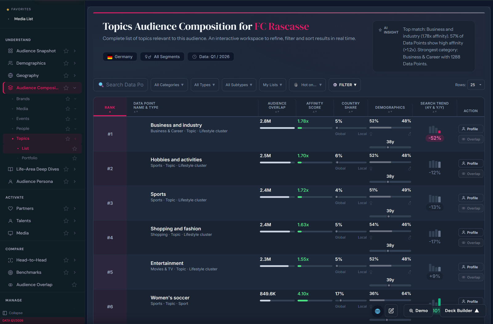
What you see: the complete, ranked topic list for FC Rascasse fans — each data point with audience overlap (e.g. 2.8M), affinity score (1.78x), country share, demographics and a 4-year search trend. Filter by category, type, subtype or your own lists; the AI insight at the top summarizes the strongest clusters for you.
⚠ Illustrative example — fictitious data for demonstration only
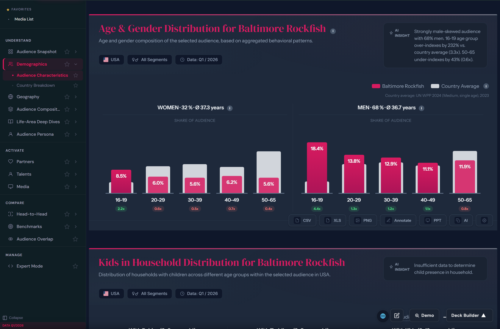
What you see: age & gender split versus the country average (UN population data) — Rockfish fans are 68% male and over-index 4.4x at 16–19. Below it: kids in household, city types and psychographics. Every chart exports to CSV, XLS, PNG and PPT.
⚠ Illustrative example — fictitious data for demonstration only
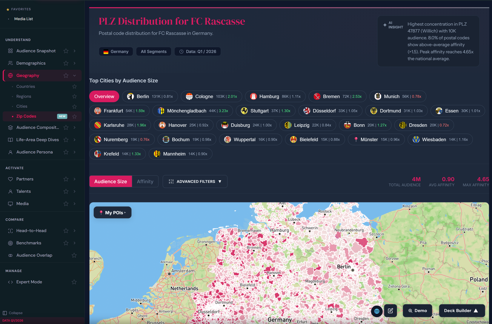
What you see: the postal-code heatmap of 4M FC Rascasse fans in Germany. Top cities ranked by audience size with affinity index, an AI insight naming the strongest postal codes, and a toggle between audience size and affinity view — the argument for every regional sponsor.
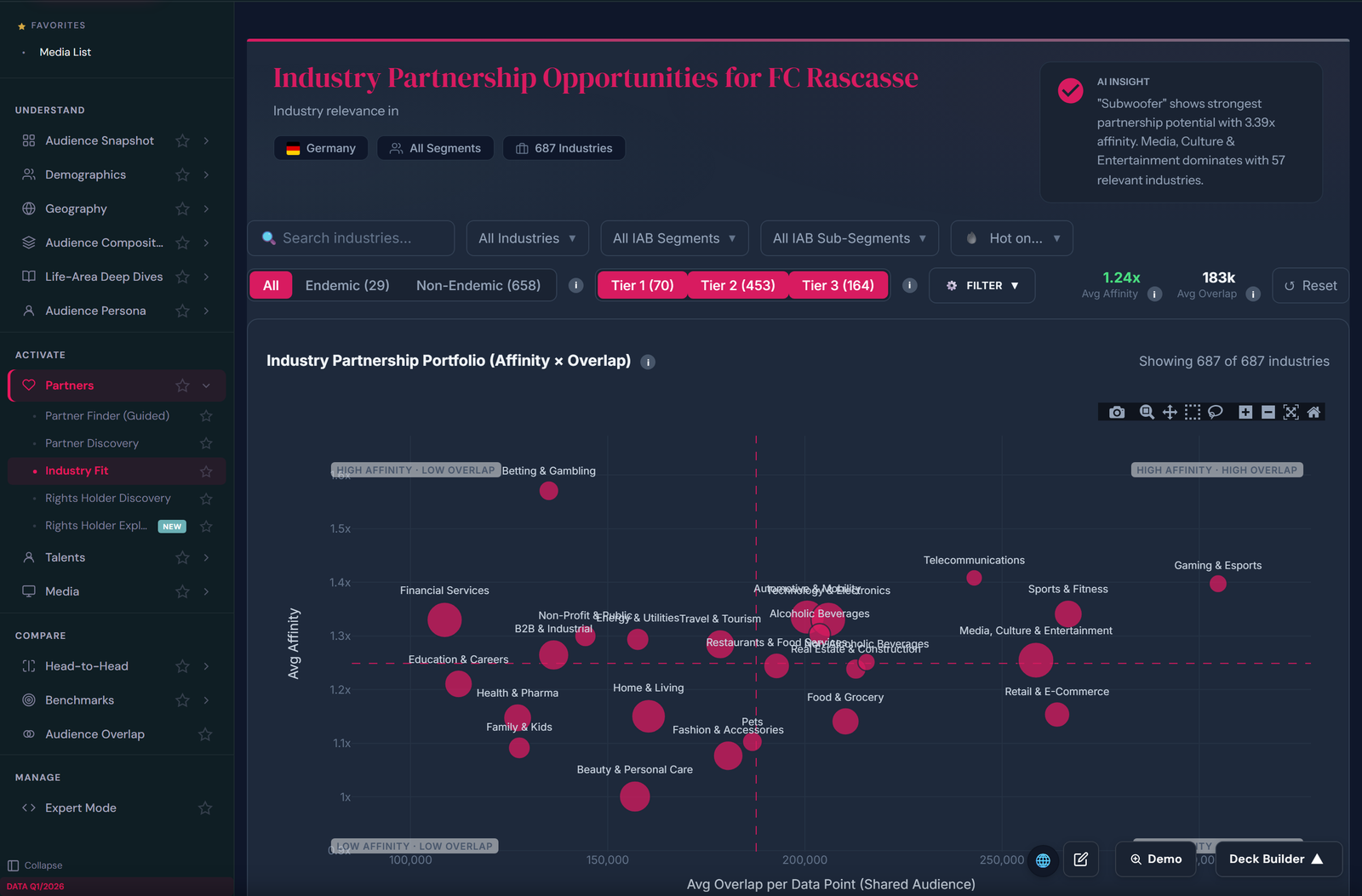
The industry lens is the right tool when the category is bigger than any single brand — think heat pumps or retail banking.
⚠ Illustrative example — fictitious data for demonstration only
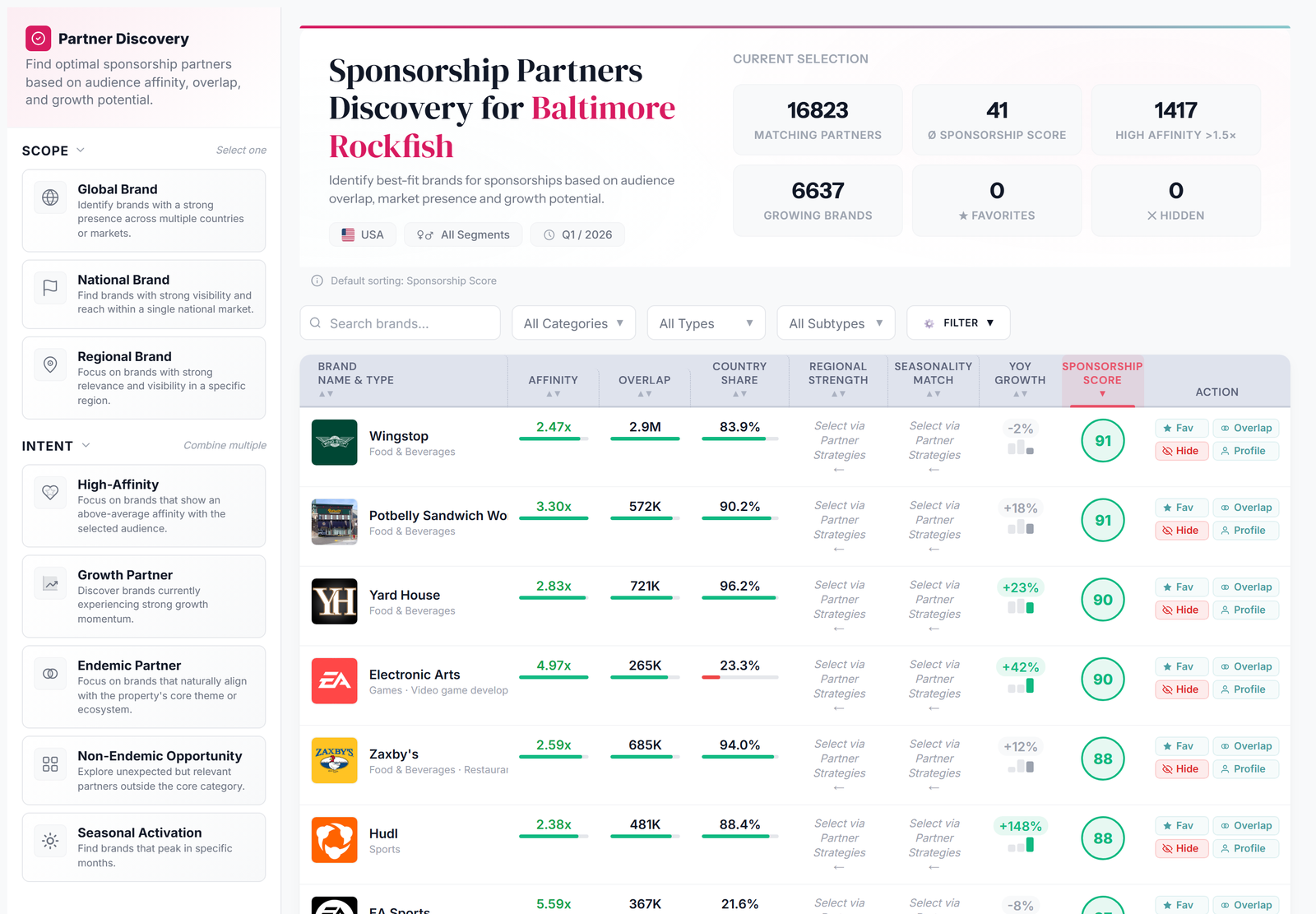
Filter by strategy: global players, regional champions, high-growth challengers, seasonal brands.
⚠ Illustrative example — fictitious data for demonstration only
30 minutes, your property as the live example.
Book a demoHorizontal charts — audience header, region split, psychographics — tell your property’s story to any sponsor, independent of who is sitting across the table.
One property story — told consistently across every deck you send out.
⚠ Illustrative example — fictitious data for demonstration only
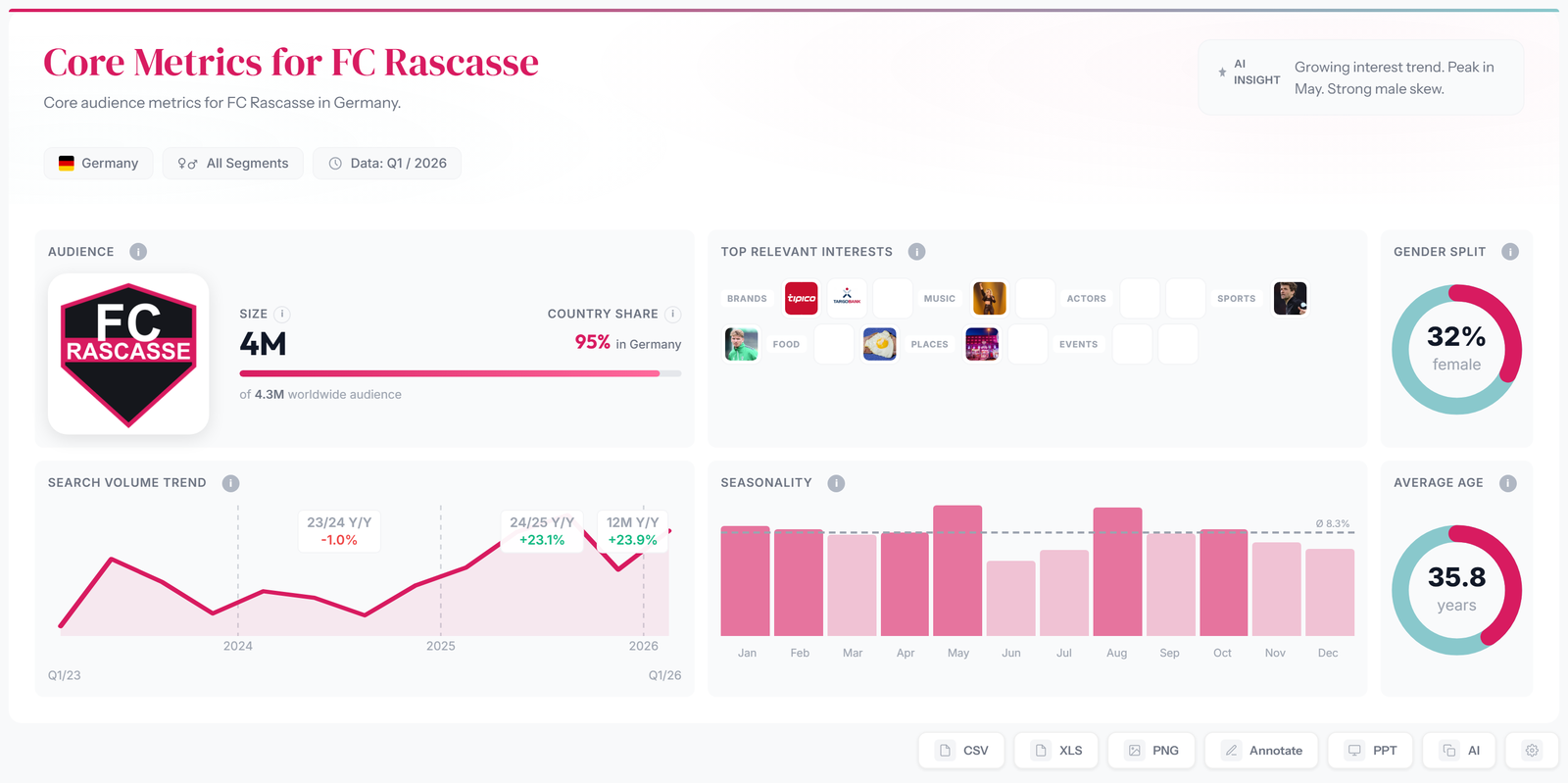
What you see: the property story on one screen — audience size, country share, worldwide reach, search-volume trend (+23.9% y/y), seasonality by month, gender split and average age, plus the top relevant interests of the fanbase.
Vertical charts are built per sponsor: the overlap page shows exactly how many fans you share with one specific brand, who they are — and what that makes your property worth to exactly this sponsor.
Every pitch shows the sponsor what only your property can deliver.
⚠ Illustrative example — fictitious data for demonstration only
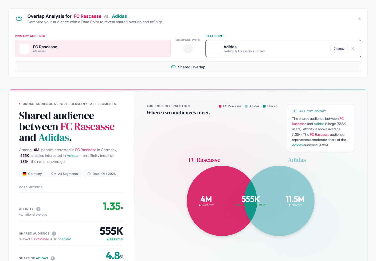
What you see: the per-sponsor page. Among 4M FC Rascasse fans, 555K are also into Adidas — affinity 1.35x above the national average. Venn diagram, YoY trends and an analyst insight, ready to drop into the pitch deck. “Change” swaps in any of the 50,000+ brands.
Every chart renders in your corporate design — your colors, your look — and exports in batch. Build a complete pitch deck without downloading hundreds of charts by hand.
From data to a branded deck in minutes — not an afternoon.
⚠ Illustrative example — fictitious data for demonstration only
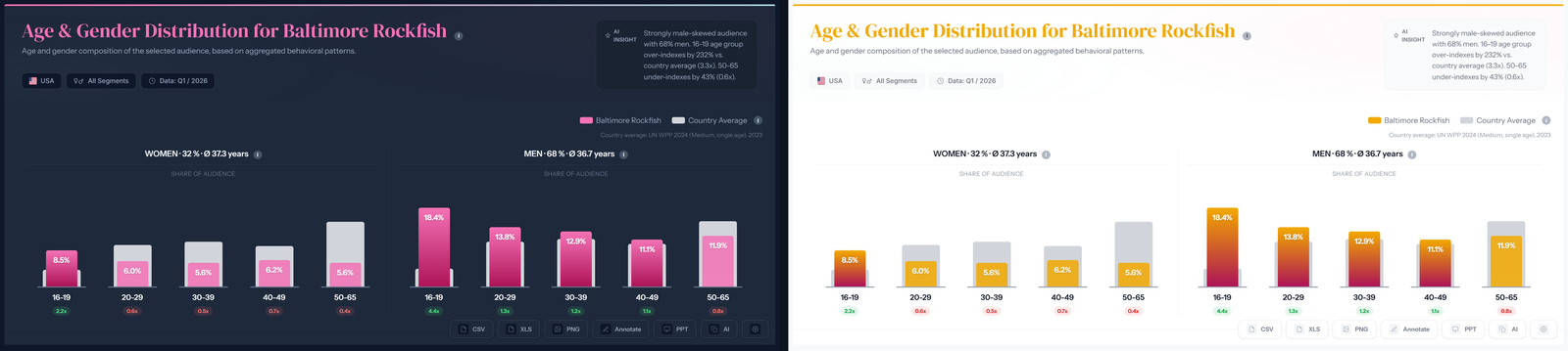
What you see: the identical chart in two skins — Rascasse default (top) versus Baltimore Rockfish gold & navy (bottom). Colors and theme switch via profile setting; every chart and every export follows automatically. No design team required.
Rascasse profiles both sides — your audience and the sponsor’s — plus the overlap: the fans who love both. What excites both audiences becomes activation material: shared topics for co-branded content, shared people as ambassador candidates, shared media channels for joint campaigns, and the regions where both are strong for local activations.
Instead of “logo on shirt”, the partnership gets a data-backed creative brief from day one.
⚠ Illustrative example — fictitious data for demonstration only
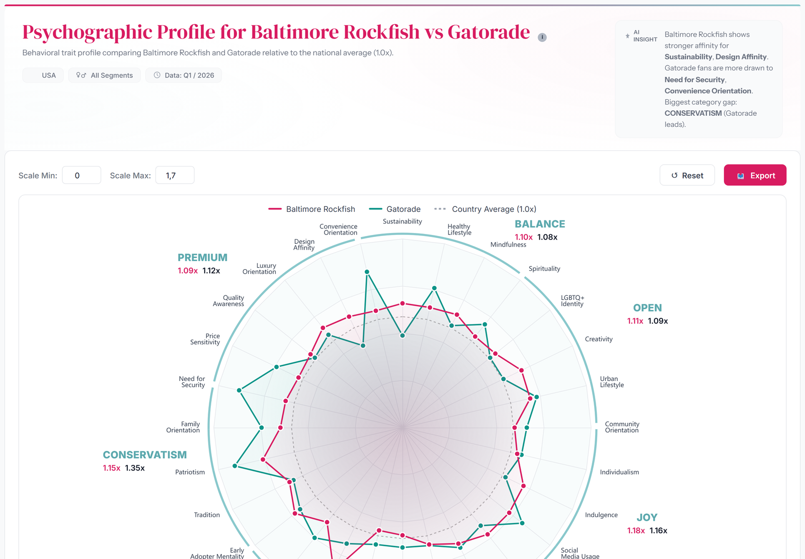
What you see: the psychographic radar of Rockfish fans versus the Gatorade audience across 30+ behavioral traits, grouped into clusters like Premium, Balance, Joy and Conservatism — with a trait selector to customize the profile. Where both sides over-index is where co-branded campaigns land, and the AI insight writes the first draft of the creative brief.
Subscription or one-off project — transparent packages, no procurement maze.
Logo visibility tells a sponsor they were seen. We show whether fans searched for the sponsor and followed it on TikTok and Instagram — monthly, before / during / after the deal, and broken down to the individual matchday: which game moved the needle most?
Every effect is benchmarked against the sponsor’s competitors, so seasonality and category trends are stripped out. And the same data tells you when to launch a fresh mid-season campaign to re-energize the deal.
⚠ Illustrative example — fictitious data for demonstration only
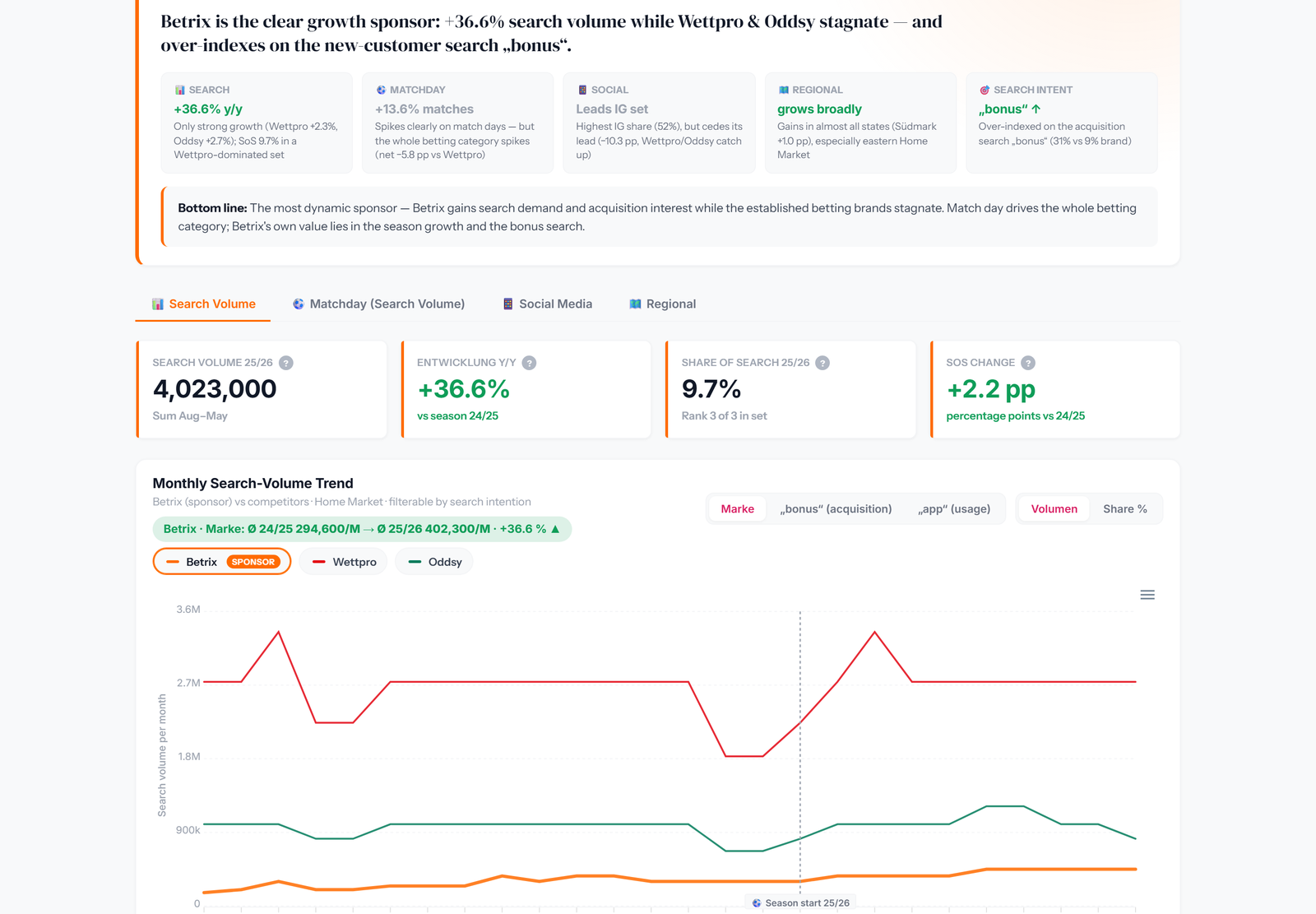
What you see: the sponsor detail from the live impact report — +36.6% search volume year over year, 9.7% share of search, and the monthly trend versus the two biggest competitors with a season-start marker. Filterable by search intent: brand, acquisition (“bonus”) or usage (“app”) searches.
⚠ Illustrative example — fictitious data for demonstration only
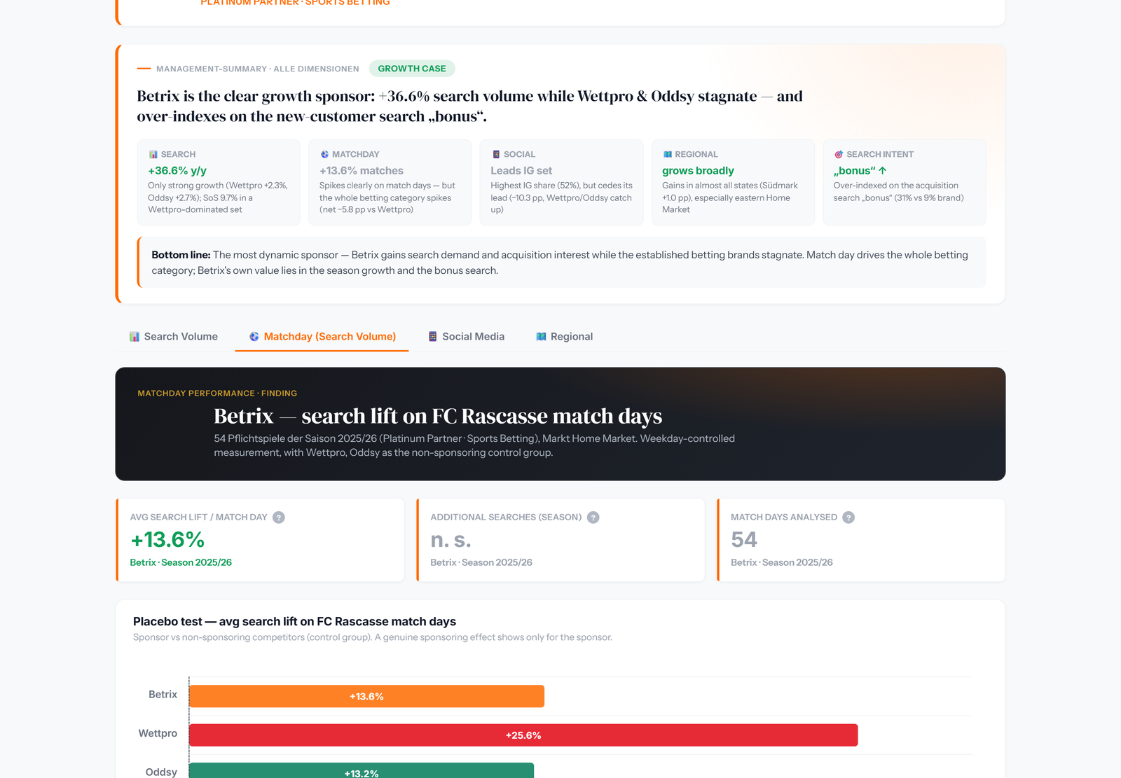
What you see: weekday-controlled search lift across all 54 matches of the season — including a placebo test against non-sponsoring competitors as the control group. A lift only counts as a sponsoring effect if the control group doesn’t spike too.
“Search interest in your brand grew measurably among our fans — while your competitors stayed flat.”
That is the sentence that wins renewal negotiations — and it comes straight out of the report.
Rascasse plugs straight into your AI stack via MCP: ask Claude or your own copilot for audience overlaps, segment fits or property scores — and get live data back, no dashboard required.
Every chart exports to PowerPoint in your corporate design — complete decks generated in one batch run, not hundreds of manual downloads.
Raw exports behind every chart for your BI stack and your own slides — the same numbers everywhere.
The same audience and overlap analysis works for concert halls, festivals, museums and event series — wherever an audience can be measured, sponsorship value can be proven.
Exposure trackers, panels, listening platforms and follower stats each measure something — just not whether your audience actually cares.
measures visibility. We measure effect.
Exposure tools count the seconds a logo was on screen. We show whether anyone actually cared — searched, followed, engaged.
ask a sample. We measure behavior at scale.
Modeled full coverage from real behavioral signals instead of what a few thousand respondents say they do.
shows conversations. Not your audience.
Knowing what is being talked about is not the same as knowing who your fans are, what they buy, and which brands they love.
show who follows you. Not who your audience is.
Your commercial audience is bigger than your follower base — and only the audience itself can be matched against 50,000+ sponsor brands.